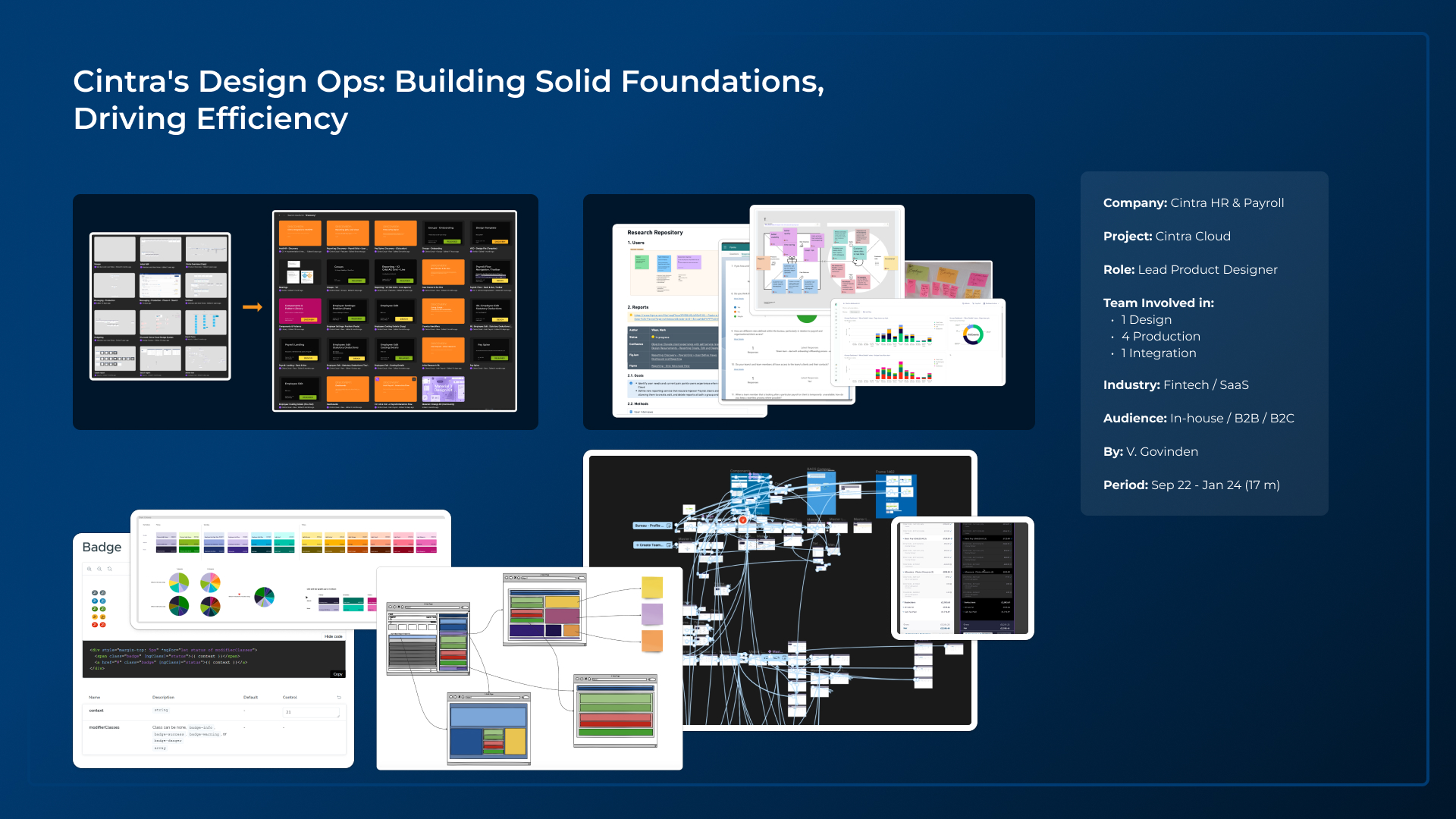
Cintra Payroll & HR (Lead / Senior Product Designer)
Key Achievements:
- Transformational Leadership: Led the transformation of Cintra's Payroll and HR services from legacy systems to a unified SaaS cloud platform, optimising user journeys for enhanced efficiency, accuracy, and data security.
- Innovative Solutions: Drove the design and development of a ground-breaking payroll management solution, reducing average payroll processing time by at least 20% and attracting high-profile clients.
- Revenue Growth: Played a pivotal role in identifying and developing new opportunities, contributing to a 40% increase in revenue. Research and analysis were instrumental in launching three new products.
Core Responsibilities:
- User-Centred Design: Conducted in-depth user research, created user personas, and developed empathy maps to inform design decisions.
- Accessibility Advocacy: Promoted web accessibility standards, conducted accessibility audits, and implemented inclusive design principles.
- UX/UI/IA Design: Developed information architectures, wireframes, mock-ups, and interactive prototypes using Figma. Iterated designs based on user feedback and testing.
- Design System Management: Collaborated with engineers to reduce technical debt, implemented dynamic rows in Figma, and utilised Storybook to test accessibility standards.
- Team Leadership: Led design teams, mentored junior designers, and fostered a collaborative work environment.
Navigating Transformation: A Design Leadership Journey
My journey at Cintra began with a unique set of challenges, stepping into the role of Senior Product Designer for the core product following a key departure. The landscape was dynamic and demanded immediate attention. While the talented UX designer was focused on refining the B2C Employee Hub, a vital replication of the legacy Self-Serve system, the heart of Cintra iQ, the legacy payroll system, was poised to become the cornerstone of our new cloud platform. This left a critical gap in the core product's design, compounded by the pressing need to seamlessly integrate disparate systems into a unified cloud experience.
To effectively navigate this, my first step was to 'get the lay of the land.' Meeting with the four Product Managers, including the Head of Product overseeing two development teams, provided essential context. Understanding the five teams, with their focus on legacy systems, database management, and the evolving Cloud and Hub platforms, was crucial. My immediate task was to bridge the knowledge gap and understand stakeholder expectations. This involved engaging directly with experienced users of the legacy platform and those adopting the cloud system, gathering invaluable insights into the strengths and weaknesses of each, and setting the stage for a cohesive and user-centric design strategy.
Deep Dive: Understanding the Existing Landscape
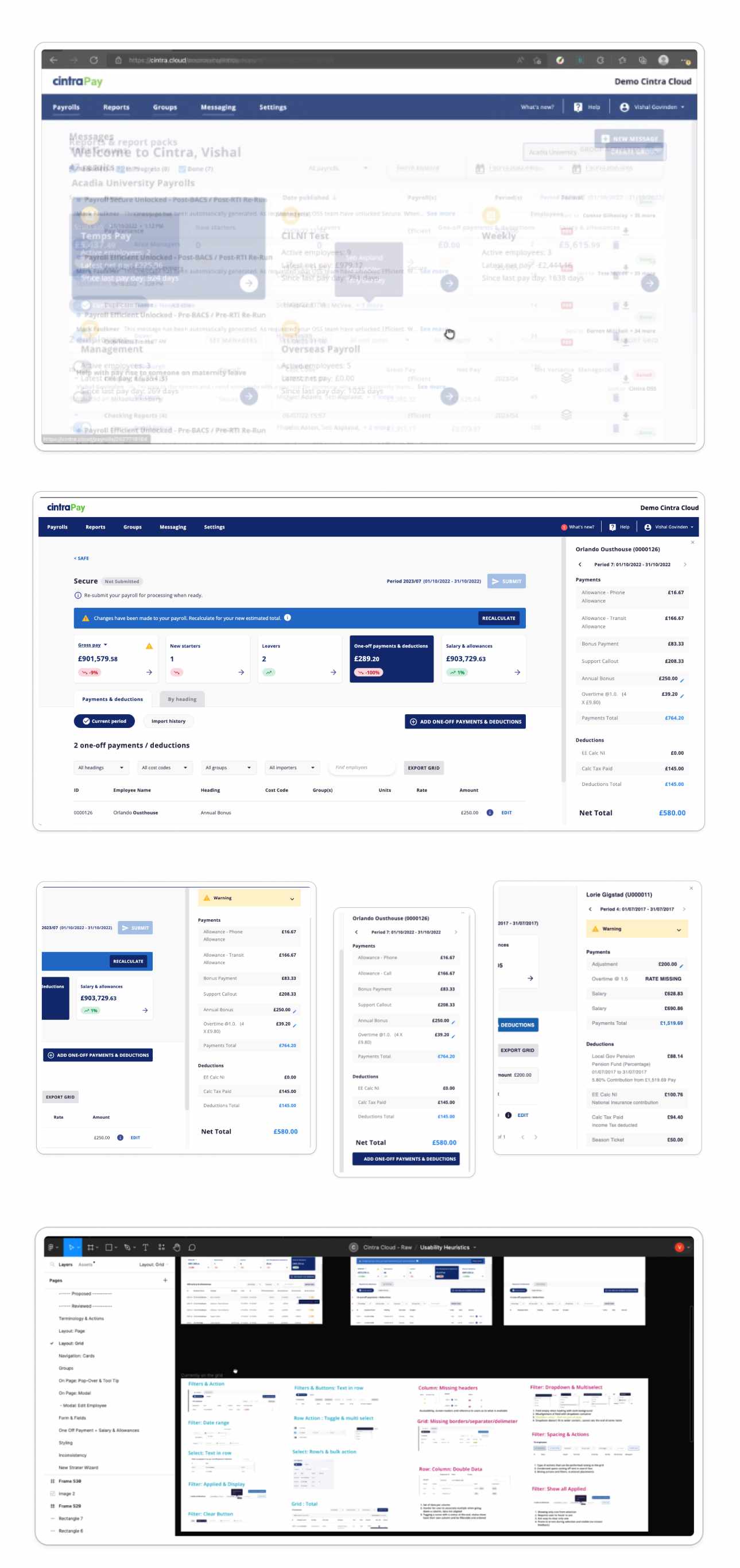
UX Audit - Heuristic Evaluation
My first task was to conduct a thorough UX audit of the Cloud Platform, employing usability heuristics to identify areas for improvement. This involved a round of interviews and observations with a range of users and stakeholders, allowing me to assess the platform's navigability, interaction, and functionality. Additionally, I reviewed the existing design files and assessed the design system in place.
Key Usability Heuristics Outcomes
- Previous Design Approach: Prioritised visual aesthetics over user needs, leading to usability challenges and data access issues.
- Lack of Efficiency: The platform was inefficient, with frequent errors and incomplete tasks for users, prompting them to switch to the legacy system.
- Poor Page Layout: Critical areas of pages lacked sufficient space, impacting user efficiency and accuracy. There were inconsistencies in the placement and access of critical information or actions.
Images below: Audit of current interface, overlay shows misalignment and inconsistent positioning of elements on pages, main content on grid and CTA require scrolling. A detailed series of screenshots and advisory for multiple areas of the platform.
Assessment of Previous User Research Data, Design Process, Design Assets & Engineering Frameworks (Tech)
Key Observations
- Missing Basic Functionality: The product lacked essential functionalities, and there were no complete functional journeys through the cloud system, which encouraged users to switch between the legacy system and the cloud.
- High-Fidelity Design Limitations: The existing high-fidelity designs struggled to handle complex functionality effectively. There were no process diagrams, maps, or wireframes to guide the development and design teams through earlier stages and decision-making.
- Fragmented Design and Inefficiencies: Final design files did not match the production UI in many places. The designs in Figma were static, layered, and copied rather than dynamic, requiring a lot of copying and editing, resulting in significant design debt.
- Lack of Use Case Diagrams: Despite the project having been underway for three years prior to my arrival, there were no use case diagrams to provide a clear understanding of user interactions.
- Incomplete Design System: The design system was a partial collection of modified UI elements from the Material UI Library. The UI components were not dynamic and detached when modified, lacking state selection variants.
- Fail Fast Motto: The 'fail fast' approach led to numerous unfinished solutions and functionalities. These were often driven by isolated problems flagged by support or sales teams rather than focusing on core user journeys.
- Absence of Research Data: There was no research data or visual documentation to illustrate the iterations and decisions that led to the final design outcomes.
Strategic Direction: Design Ops and Solution Implementation
Proposed Strategic (Design Ops) Plan: Gaining Buy-in and Establishing Credibility
After completing my in-depth research and design assessment, the next crucial step was to present my findings to the Head of Products and other key stakeholders. My goal was to paint a clear picture of the current state of the platform and design resources, highlighting the misalignment with both short-term and long-term goals if significant changes were not implemented.
To address the identified issues and drive meaningful change, I proposed an initial strategic plan focused on bringing consistency and defining clear standards. This plan included:
- Establishing a Cohesive Design System: We would streamline development and ensure consistency across the platform by creating a comprehensive design system. This system would include dynamic and modular UI components to improve scalability and maintainability.
- Implementing a Structured Design Process: To organise and implement a structured design process and files to support an agile methodology. This approach would ensure that the design process is efficient and aligned with agile principles, facilitating smoother collaboration between teams.
- Supporting the Product Manager: Assisting the Product Manager in reverting to his previous process of creating clearer documentation with user stories and supporting materials. This would improve clarity and ensure all stakeholders have a shared understanding of project goals and user needs.
- Enhancing the User Experience: By addressing the usability issues identified in the audit, we aimed to align the design process with user needs and business goals. This included improving navigability, functionality, and overall user satisfaction.
Greenlight for the Challenge
Ultimately, I received the greenlight to move forward with the strategic plan. This was a pivotal moment, marking the beginning of a beautiful challenge. With the team's buy-in, I was ready to lead the transformation of Cintra's platform into a more efficient, user-friendly, and future-proof solution.
Orchestrating the Change: Design System, Process, and UX
With a clear understanding of the platform's current state and user needs, my focus shifted to strategizing the migration of Cintra's legacy systems to a cohesive cloud-based solution. This section details the key strategies and methodologies I employed to drive this transformation.
1. Establishing a Cohesive Design System
One of my first steps was to have a session with the Product Team to demonstrate what a design system looks like—from its infancy to a full-fledged collection of multiple libraries. I explained how a design system evolves and remains dynamic, especially relevant as we were undergoing a rebrand around the same time. This session aimed to illustrate the importance of a comprehensive design system and its impact on both short-term and long-term goals.
To support this initiative, I took several concrete steps:
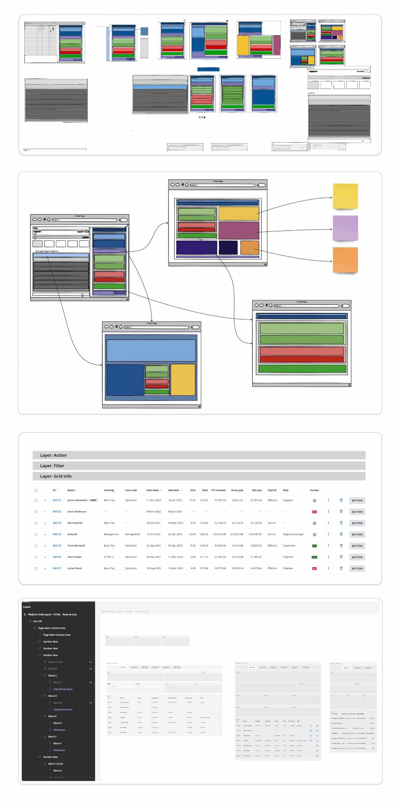
- Custom Figma Modular Layout Framework: I created a custom modular layout framework in Figma to support consistency and ensure compatibility with Bootstrap or any future layout frameworks. This was particularly helpful for my design colleagues when positioning elements that needed to be responsive. It also enabled developers to maintain elements within set locations in the layout while manipulating them with CSS & JS as required.
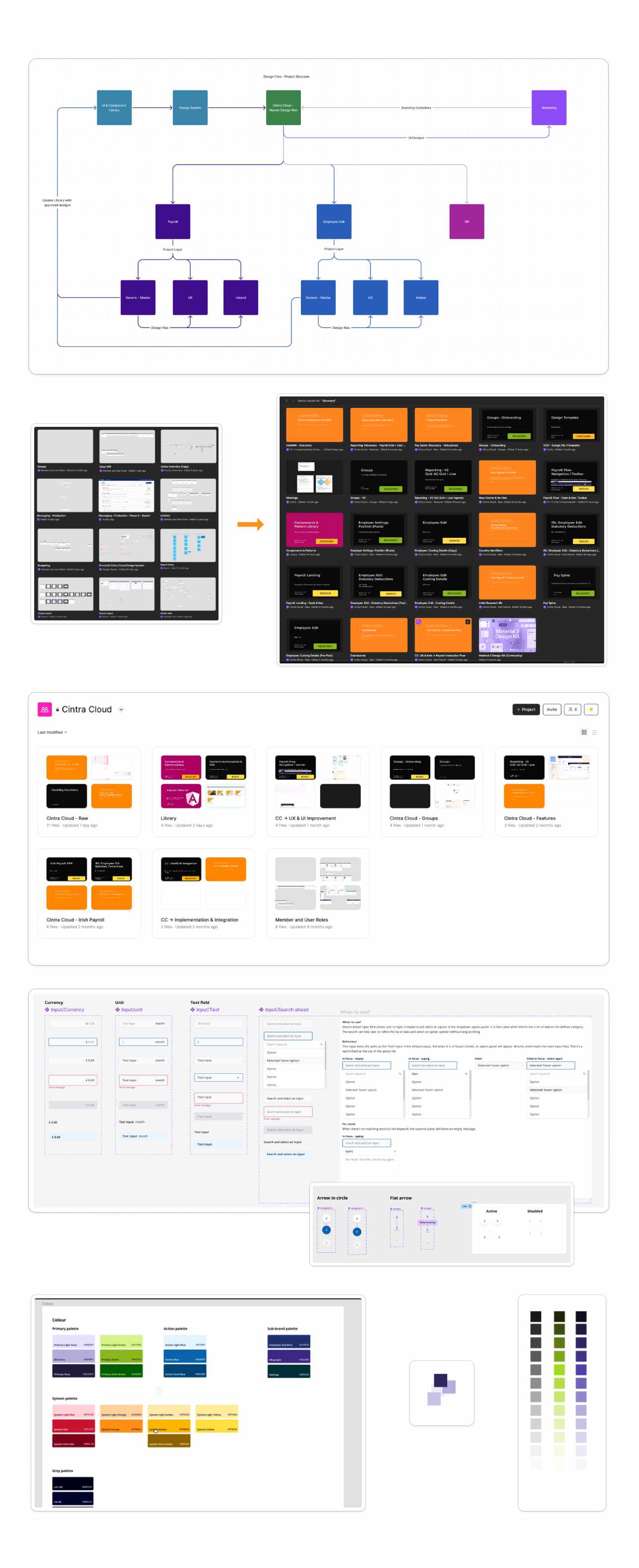
- Organising Libraries: I organised our existing UI Library and created new component and style libraries. This effort was crucial in bringing order and consistency to our design resources.
- Dynamic Components: I developed initial block components to replace static designs, ensuring they were dynamic and could work within our new framework. These components could be adjusted to represent fully-fledged features or scaled down to an MVP without losing integrity and dynamism.
This framework and dynamic component system ensured that our design system could adapt and grow, maintaining consistency and efficiency across all projects.
Re-structuring & Organising the Design System & Design Files
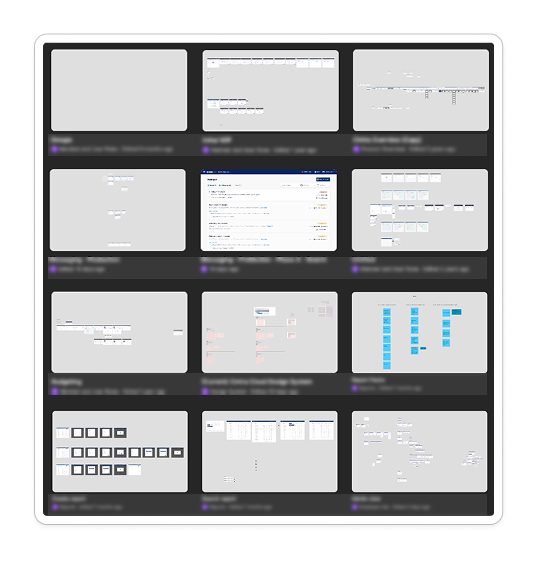
After a few months of following a structured management approach for our design files across multiple teams and products, we could easily access and expand on grouped features. We created a separate file for Research & Discovery, while also keeping the status of each feature and product clearly visible at a glance. This restructuring helped the development team, as the previous siloed approach created a lot of inconsistencies. We now have a Design System composed of Component Libraries, Pattern Libraries, and Style Guides
Planning & executing dynamic components
While improving our workflow we also improved user workflows and efficiency.
2. Implementing a Structured Design Process
To further support the transition, I implemented a structured design process to ensure alignment with agile methodologies and enhance collaboration among teams. Key steps included:
- Maps of Legacy Platform and Feature Matrix: Created comprehensive maps of the legacy platform and a feature matrix to understand existing functionalities and plan the migration effectively.
- Organising & Documenting User Research & Discovery: Conducted and documented user research and discovery sessions to gather valuable insights and inform design decisions.
- Created Use Cases and User Stories: Developed detailed use cases and user stories to capture user needs and scenarios.
- JTBD (Value Proposition) & 5Es of Usability Frameworks: Introduced the Jobs-to-be-Done (JTBD) framework and the 5Es of Usability (Effectiveness, Efficiency, Engagement, Error Tolerance, and Ease of Learning) to guide the design process.
- Introduced User Hierarchy over Limited Personas: Moved beyond limited personas to a more comprehensive user hierarchy, ensuring a deeper understanding of user needs and behaviours.
- Interaction Design and Information Architecture: Focused on interaction design and information architecture to create intuitive and user-friendly interfaces.
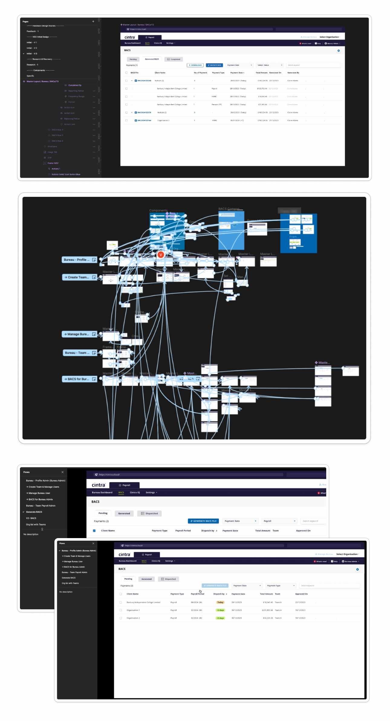
- Wireframing and Prototyping: Used wireframes to validate designs early with users and the development team, ensuring alignment before progressing to mid-level and high-fidelity wireframes. Created prototypes with use cases to test and iterate on designs.
3. Supporting the Product Manager
In addition to implementing the structured design process, I worked closely with the Product Manager to enhance the clarity and effectiveness of project documentation. This included:
- Creating Clear Documentation: Assisted in creating detailed documentation with user stories and supporting materials to ensure all stakeholders had a shared understanding of project goals and user needs.
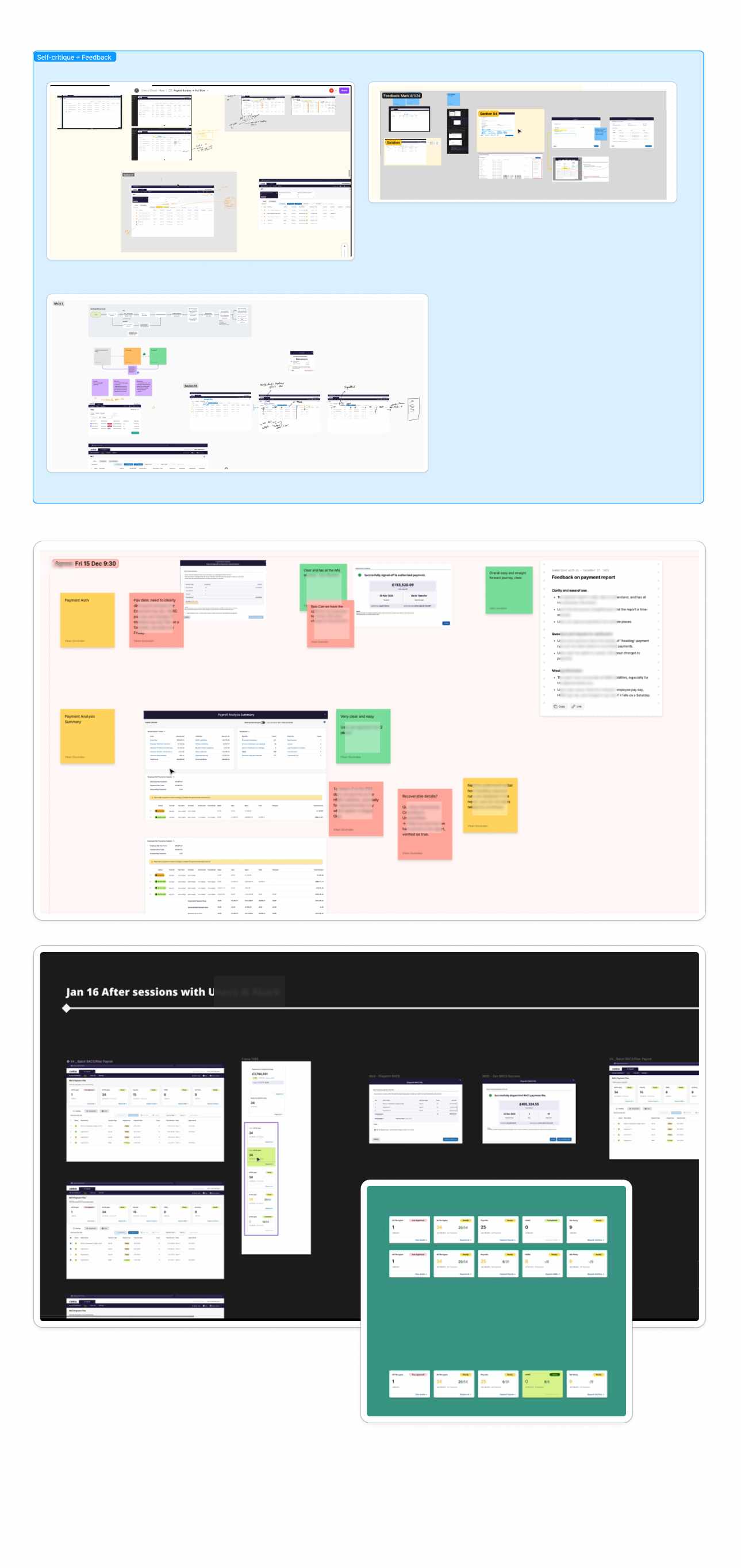
- Feedback Loops: Established feedback loops to gather input from users and the development team, facilitating continuous improvement and alignment.
4. Enhancing the User Experience
By addressing the usability issues identified in the audit, we aimed to align the design process with user needs and business goals. This included improving navigability, functionality, and overall user satisfaction.
What was Cintra Payroll about?
We refocused on the important elements as part of the Jobs To Be Done (JTBD) framework, applied with users and the core value proposition of the platform. The primary objective was to enable users to see and manage employee data effectively for employment and payment purposes.
To supplement this, we integrated the 5Es of Usability framework, ensuring that the platform was:
- Effective: Prioritizing accuracy in managing employee data.
- Efficient: Enhancing the platform's ability to complete tasks swiftly and correctly.
- Engaging: Creating a user interface that is appealing and keeps users interested.
- Easy to Use: Simplifying navigation and interactions for all users.
- Error Tolerant: Ensuring the system can handle user errors gracefully and provide corrective measures.
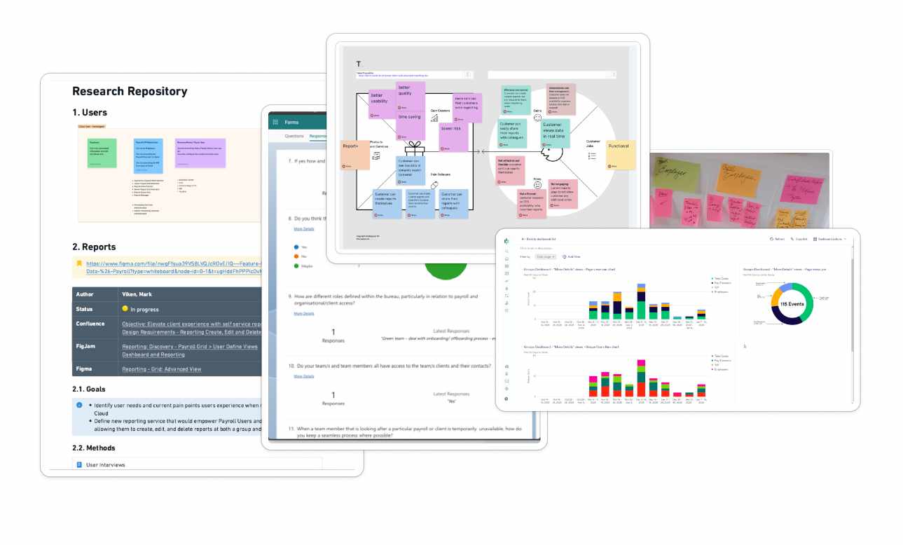
Research Repository
As part of the new structured design process, different methodologies are used to gather research that informs design decisions. This repository makes research easily accessible and relatable to features and functionalities.
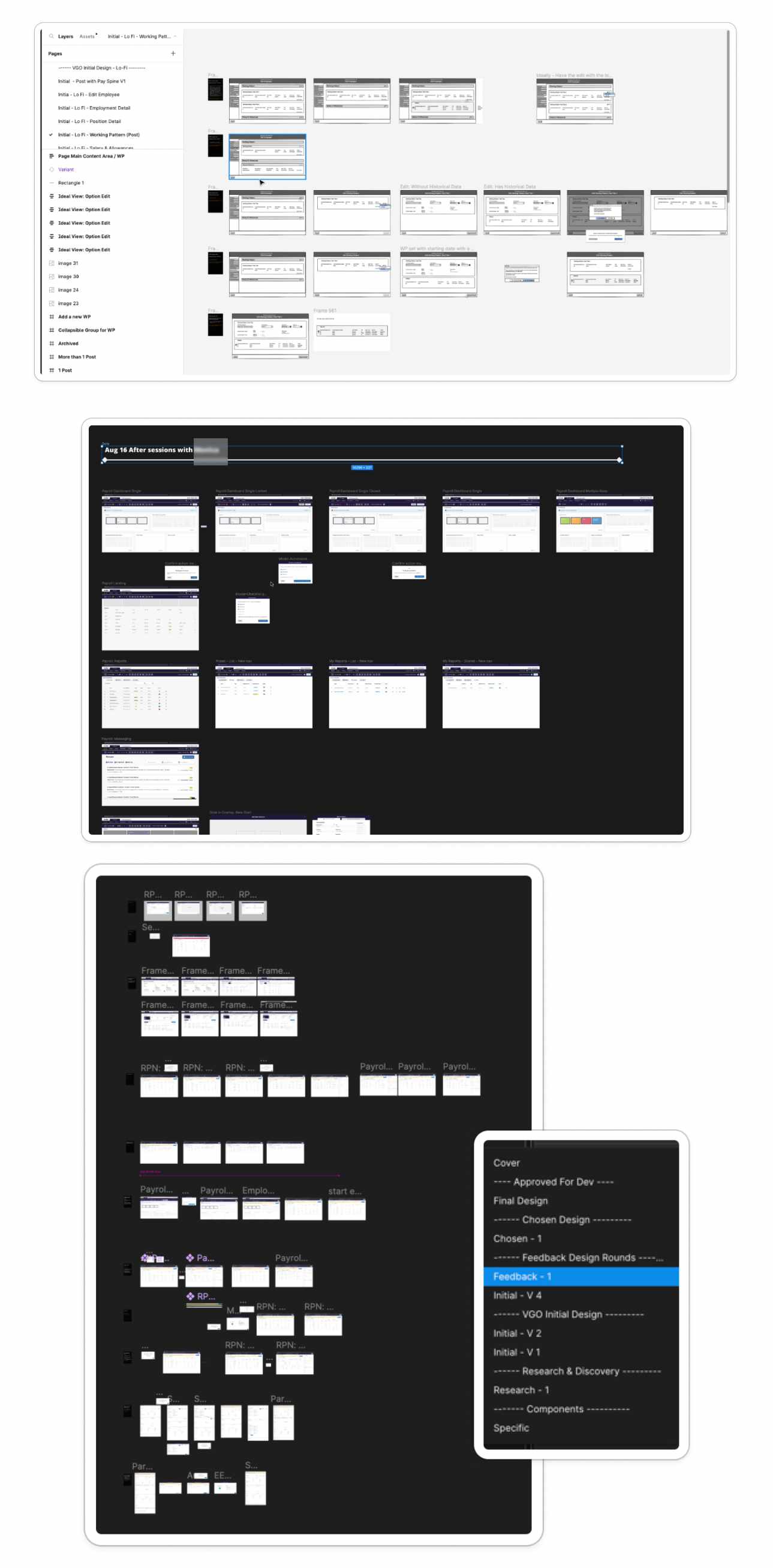
Ideation
Keeping the same structure and flow across different fidelity
Prototype
User Feedback & Critique and Iteration
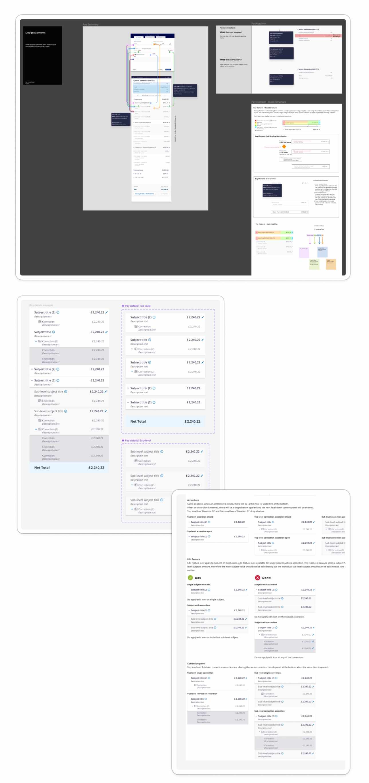
Final Design & Handover
Growth and Leadership: Expanding Design Capabilities & Fostering Talent
"As the strategic vision solidified and our design operations became increasingly streamlined, the design team experienced significant growth. Recognizing the pivotal role of a robust design system in scaling our platform, particularly within the demanding education sector, I spearheaded the recruitment and development of a talented team. This culminated in leading two Product Designers and two UI Engineers, all focused on realizing a cohesive and accessible design vision across our platform.
Beyond simply managing, I actively mentored and nurtured talent. Notably, I guided our UX Designer through their career progression to become a fully-fledged Product Designer. My leadership style was hands-on and approachable, ensuring I was always available to provide context, answer questions, and offer constructive criticism. I believe in leading by example, demonstrating the principles of good design and fostering a collaborative environment.
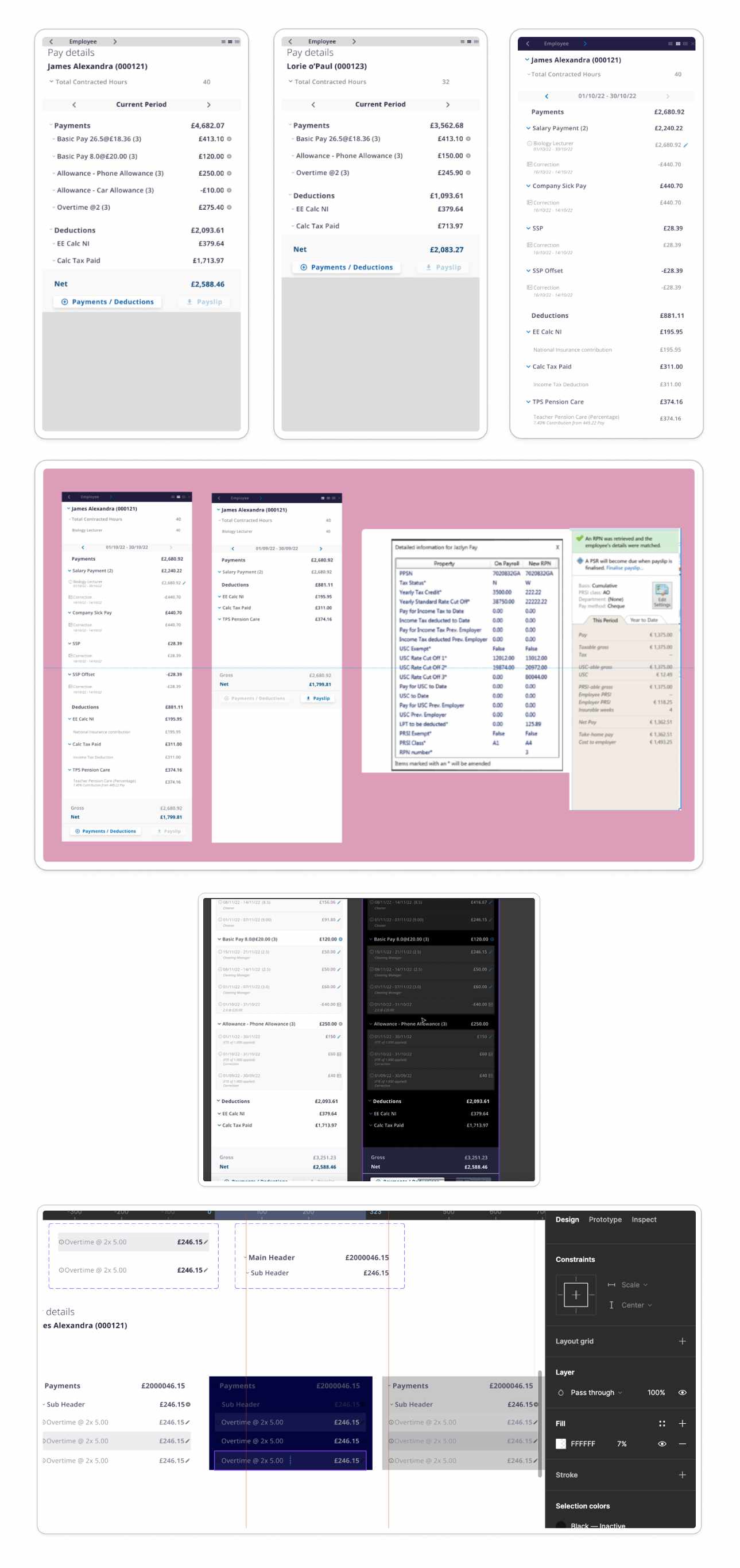
A key achievement was the creation of a live component library within Storybook. This initiative was driven by the increasing importance of accessibility and adherence to industry standards within the education sector. By assembling a dedicated team of designers and UI engineers, we were able to build a robust and maintainable design system that ensured consistency and efficiency across our platform.
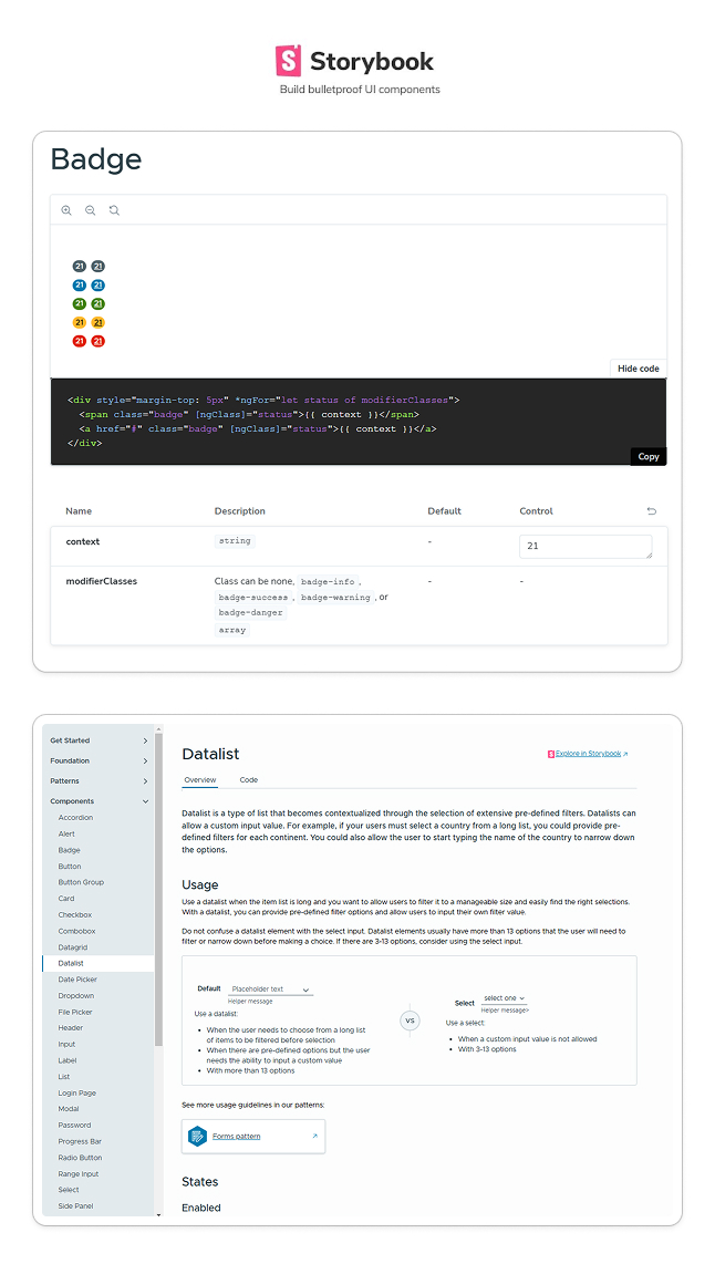
These screenshots showcase the tangible results of our efforts as we leveraged Clarity Design. The live component library in Storybook provided a single source of truth for our design system, enabling rapid development, consistent implementation, and improved accessibility. This initiative not only streamlined our workflow but also empowered our team to deliver high-quality, user-centered experiences.
My commitment to talent development and strategic leadership ensured the design team was well-equipped to meet the growing demands of our platform and the evolving needs of the education sector. By fostering a culture of collaboration, mentorship, and continuous improvement, we were able to elevate our design capabilities and drive significant impact.
Results and Reflections
Looking back at the journey at Cintra, the significant impact and measurable outcomes of the work are clear. Here’s a summary of the key results and reflections:
Structured Design System:
A structured design system was implemented and is now shared across the business. This system is utilised by Sales and Marketing, ensuring consistency and efficiency in design practices.
Development Time Reduction:
Contributions to simplifying user journeys and UI helped reduce development time by up to 60% in certain cases, streamlining the process and enhancing user experience.
Enhanced Onboarding and Efficiency:
By eliminating blockers and providing accurate and efficient solutions, it became possible to effectively remarket Cintra Cloud. This resulted in time savings of up to 50% for users in some cases, improving the overall user experience.
Accelerated Design Delivery:
Within a relatively short period, a substantial amount of high-quality design work was delivered. These contributions were instrumental in pushing out the largest and most complete features and functionalities since the platform’s initial launch in 2020. The designs also supported marketing and sales efforts, contributing to the attraction of new high-profile customers.
Vision for the Future:
A compelling vision for Cintra Cloud’s potential was created, illustrated through an interactive mid-fidelity prototype. This prototype showcased achievable enhancements and provided a guide for future development.
Leadership Acknowledgement:
The contribution to the Special Interest Group (SIG), focused on user research and testing, was acknowledged by the CEO during a company-wide meeting. This group's work led to the launch of new products and features targeting and diversifying specialist industries, demonstrating the value of user-centered design.
